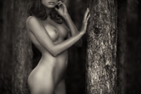
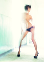
When I was working through my shots just after the Bodygraphia symposium I sent a set of low res' previews over to my good friend Jason Kotecha. He liked most of them, some more than others, but his exact comment on this one was:
"This to me is more cheesy 80's Playboy. It's nice but not particularly interesting. Also that arched back is distracting as she looks disfigured."
So, there you have it, no need for any critique on this one ;-)
I'll be posting his favourite (from the small set I sent him) next.
|
captured camera lens focal length aperture shutter speed shooting mode exposure bias metering mode ISO flash image quality RAW converter plugins (etc) cropped? |
6.14pm on 17/8/10 Canon 5D Mark II EF 70-200mm f/2.8L IS USM 115mm f/2.8 1/160 aperture priority +2/3 evaluative 400 no RAW ACR Bokeh no |
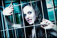
Of the three 'caged' shots of Iva that I've posted (here and here), this is my favourite by far: mostly because I think it's simply a better shot, but also because the cage seems to serve a different purpose here. In the second shot I posted (and to a lesser degree in the first) the cage was something that contained Iva, and as I previously mentioned, caging women, even for the purposes of conceptual photography, isn't something I'm especially comfortable with.
In this shot though, it looks like the tables have been turned, i.e. the cage is there to protect us from her: she looks powerful, possibly dangerous ... while in the previous two she seemed more of a victim.
Anyway, given that all three share the same theme, let me know which you prefer and, if possible, why.
In other news ...
The winners of our weekend competition to win a subscription to our Photoshop tutorials are as follows:
Ronan Palliser won the 12 month subscription.
Martin Bornack won the lifetime membership upgrade.
John Cavacas won a signed copy of one of my latest books.
And the answer to the question - "what was unusual about the post-production (beyond the normal contrast adjustments, black and white conversion, and so on)" - is that this the final image was a composite of three originals: one for the majority of the image, another for her right eye (and eyebrow), and a third for her left eye (and eyebrow). The problem I had with this one is that I really liked the overall feel of the main image but, because I inadvertently back-focussed, both her eyes were soft (in this case, too soft to sharpen). I didn't much like any of the shots where her eyes were sharp - well, I didn't like them as much as this one - so I decided to blend three images. I should add that this isn't a technique I'd recommend - it took ages to align her new eyes (mostly using the Warp tool) - but it was the only practical method I could think of that would rescue this image. Well done to everyone who managed to work this out (or get reasonably close).
GET 25% OFF OUR TUTORIALS THIS BANK HOLIDAY WEEKEND
Anyway, if you weren't one of the lucky winners you'll be pleased to hear that we're offering a 25% discount on our Photoshop tutorials to celebrate the August Bank Holiday weekend. Click the following link for more details:
http://www.chromasia.com/tutorials/online/
PLEASE NOTE that this offer ends at midnight, Pacific Standard time (i.e. UTC-8) today.
|
captured camera lens focal length aperture shutter speed shooting mode exposure bias metering mode ISO flash image quality RAW converter cropped? |
12.39pm on 16/8/10 Canon 5D Mark II EF 24-70mm f/2.8L USM 34mm f/11.0 1/100 manual n/a evaluative 100 yes RAW ACR no |
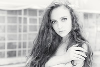
Of all the shots I took of Iva during the recent Bodygraphia symposium this is definitely one of my favourites, but while it looks like a relatively straightforward high-key portrait it was slightly more complicated to produce than I expected.
Rather than explain why though, at least at this stage, I thought I'd use this shot as the basis for a competition to win a 12 month subscription to our Photoshop tutorials.
All you need to do is take a look at this image and tell me what was unusual about the post-production (beyond the normal contrast adjustments, black and white conversion, and so on). You'll need to compare the processed version to the original, which you can do by hovering your mouse over the 'show the original' link (bottom-right of the image), and then email your answer before midnight GMT on Sunday 29th to ...
djn1 [at] chromasia [dot] com
If you've already taken out a subscription, we have a couple of prizes for you too: one for annual subscribers, the other for one of our lifetime members. If you're an existing annual subscriber and can correctly identify what was unusual about the post-production, email us using the link above for a chance to win a lifetime membership upgrade.
If you already have a lifetime membership, you can win a signed copy of one of my latest books - Practical HDR or Extreme Exposure. Just let us know which you would prefer when you email your entry.
Please don't post your answer as a comment, but do let me know what you think of this shot :)
|
captured camera lens focal length aperture shutter speed shooting mode exposure bias metering mode ISO flash image quality RAW converter cropped? |
11.50am on 16/8/10 Canon 5D Mark II EF 24-70mm f/2.8L USM 63mm f/4.0 1/100 aperture priority +2/3 evaluative 100 no RAW ACR no |
First: thanks for all your comments on my last image - they were much appreciated. It's always interesting when I post something that generates some debate :)
I'm also expecting that this one might generate a fairly polarised response too. Unlike yesterday's shot, which I did like, I'm not especially happy with this one. At this stage I'd rather not say why, but will post an update after I've heard what you think.
What I will say is that Iva (the model) really liked it. As I mentioned when I posted this shot, Iva is heading to Scotland later this year to study Philosophy, Film and Visual Culture at Aberdeen University (I think). When she saw this image, and some of the other 'cage' shots, she said that they reminded her of Bentham's Panopticon. If you haven't come across the idea, the panopticon was a design for a prison: where the prisoners would could be watched at all times, but would never know when or if they were being actively observed. Bentham designed the prison in 1785 (it was never built) but the idea was later taken up by Michel Foucault as a metaphor for modern societie's ever-increasing tendency to observe and normalise behaviour.
Anyway, let me know what you think, and I'll post my thoughts either later today or tomorrow.
On a totally different matter ...
Stop by tomorrow for a chance to win a twelve month subscription to our Photoshop tutorials. I'll post the full details tomorrow, but will also update my Facebook and Twitter accounts when the competition goes live.
|
captured camera lens aperture shutter speed shooting mode exposure bias metering mode ISO flash image quality RAW converter cropped? |
12.31pm on 16/8/10 Canon 5D Mark II EF EF 15mm f/2.8 fisheye f/13 1/125 manual n/a evaluative 100 yes RAW ACR no |
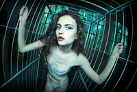
Libby (my wife) is normally a very good judge of how my images will be received by you, which, in this instance, is a bit worrying. Here's how the conversation went on this occasion:
Me:"What do you think of this one? I like it, partly because it's different, but also ...".
Libby: "This really is the most horrible shot you've ever produced!"
Me:: "The most horrible?"
Libby: "Yes."
Me: "Oh ... OK ..."
I think she was probably exaggerating, or didn't trawl far enough back through the archives to find something genuinely horrible, but her opinion is clearly somewhat different from mine ;-)
So ... love it, hate it, couldn't care less? Let me know.
|
captured camera lens focal length aperture shutter speed shooting mode exposure bias metering mode ISO flash image quality RAW converter cropped? |
12.31pm on 18/8/10 Canon 5D Mark II EF 24-70mm f/2.8L USM 70mm f/2.8 0.8s manual n/a evaluative 100 yes RAW ACR yes |
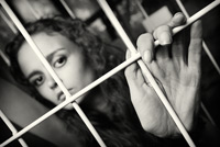
One of the locations that was available to us during the Bodygraphia event was an old factory. Part of the factory was in use – producing bedding, mattresses, and so on – but a lot of the rooms were empty. There was lots of peeling paint, broken windows, dark corners, rickety staircases, and so on: in short, lots of great places to take photographs. One thing that we found, as we wandered around during our first session, was a white cage on wheels which was used to transport various materials around the factory. We decided that this would make a great prop so set up the light – a single large softbox – and took a variety of shots.
Of the three shots of Iva that I'll be posting, this is probably the least dynamic, but I'm pleased with it. As for the other two: one is my favourite of the set, but I'm really not at all sure about the other – for reasons that I'll explain when I post it.
In the meanwhile, let me know what you think of this one.
|
captured camera lens focal length aperture shutter speed shooting mode exposure bias metering mode ISO flash image quality RAW converter cropped? |
12.41pm on 16/8/10 Canon 5D Mark II EF 24-70mm f/2.8L USM 55mm f/11 1/100 manual n/a evaluative 100 yes RAW ACR no |
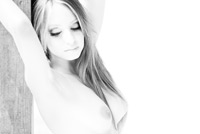
When I posted my last shot I mentioned that there were three broad categories of shots that I took during the Bodygraphia photographic symposium: ones that I staged, ones that were shot while someone else was directing the model, and a set of portraits of Iva Sakarova. This one (kind of) falls into the second category, though I don't think anyone in particular was directing Maria at this point – she was just doing model-type stuff while we all photographed her.
And yes, I know it's a cliché – both conceptually and aesthetically – but I am pleased with how it turned out :)
In terms of the post-production …
If you've taken a look at the original you'll see that this one was over-exposed (by 1 2/3 stops). I did think about going with the metered exposure, but as Maria was standing in the shade, most of the light was coming from behind her, and I was shooting at ISO 400, I decided to go for a high-key portrait from the outset rather than spend ages trying to 'lift' the image in Photoshop. That said, I did use some of the techniques I discuss in my Portraits: part two tutorial, but on the whole the post-production was a simple matter of tidying up the background, cloning out a few other distracting details, converting the image to black and white using the Channel Mixer (as described in both my B&W tutorials: here and here), then using a couple of masked curves (one for contrast, the other to lighten Maria's face and hair).
|
captured camera lens focal length aperture shutter speed shooting mode exposure bias metering mode ISO flash image quality RAW converter plugins (etc) cropped? |
1.19pm on 17/8/10 Canon 5D Mark II EF 70-200mm f/2.8L IS USM 155mm f/5.6 1/100 aperture priority +1 2/3 evaluative 400 no RAW ACR none no |
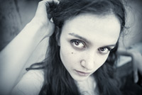
I've spent most of the last few days processing my shots from the Bodygraphia event and have 13 images that I'll probably post over the next week or so: 12 that are directly related to the event, and one random shot of a couple of forest rangers we came across during one of the shoots. In looking through them all, and trying to make sense of the event and my reaction to it, I realised that the images fall into three main categories.
The first category could be described as 'shots that were contrived for the purposes of the event', i.e. where I decided exactly what to shoot, set up the lights, directed the model (kind of), and so on. There are only three shots in this category, all taken during the same session.
The second category are all images that were taken while one of the rest of my group was shooting. In other words, they're opportunistic shots. There are five shots in this category.
The final category, of which this shot is an example, is a set of portraits of Iva Sakarova, one of the five models that were present at the event. Interestingly, seven of the 12 shots I'll be posting are shots of Iva, probably because I found her the easiest to work with. I should add that all the models were great but I found it much easier to 'see' the shots I wanted when shooting her. That's not a great explanation, but I don't think I can put it any better at the moment.
Anyway, as Iva will be featuring in quite a few shots, here's a bit of background ...
She's been modelling professionally for three years, currently lives in Bulgaria, but is heading off to Scotland later this year to study Philosophy, Film and Visual Culture. I'm hoping to meet up with her again before she leaves so will probably have a few more shots before the end of next month.
As always, let me know what you think.
|
captured camera lens focal length aperture shutter speed shooting mode exposure bias metering mode ISO flash image quality RAW converter cropped? |
11.52am on 16/8/10 Canon 5D Mark II EF 24-70mm f/2.8L USM 25mm f/2.8 1/200 aperture priority +1/3 evaluative 100 no RAW ACR no |
| Tweet |
|

|
|
| • 3x2 + people [portraiture] + no print + show the original | |||
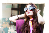
My apologies for the complete lack of recent updates but it's been a very busy couple of weeks. I've been recording my latest tutorial (more info here), Libby has gone back to the UK for a fortnight, and I've had a hundred and one other things to get through before I could find time to shoot or post any new material.
The most recent, and exciting, is that I've been taking part in a Bulgaria photographic symposium ;– Bodygraphia – focussing on the the body. I've included the link to the English version of the site below, but please note that a lot of the images feature nude bodies.
It was a three day event, and there were 16 of us taking part. We were split into four groups, assigned two models a day (one for the morning, one for the afternoon), and had three days to shoot in a variety of locations: a factory, nightclub, a hotel spa, a traditional Bulgarian house, or a location of our choice. My group spent two sessions in the factory, one at the Bulgaria house, one in the spa, one at a local lake, and one at the nightclub (I had to miss that one).
All things considered, I had a really good time, but it was so far outside my normal comfort zone that I found it very challenging. For example, I'm used to photographing people, but not at all used to directing models. We also had a range of lighting kit available to us. As you know though, lighting isn't exactly one of my specialities, so that was rather hit and miss too. The net result though is that I got quite a few shots that I'm pleased with - some that fit with the theme of the symposium, and some that don't.
This one is in the latter category :-) It was taken before we started shooting at the factory, and I should probably explain that the goggles were brought along by one of the members of my group and Iva, our model for that session, was trying them on outside one of the buildings.
Anyway, I'll post more shots over the next week or so, some of which are a bit more serious than this one ;-)
|
captured camera lens focal length aperture shutter speed shooting mode exposure bias metering mode ISO flash image quality RAW converter cropped? |
10.15am on 16/8/10 Canon 5D Mark II EF 24-70mm f/2.8L USM 70mm f/4.5 1/125 manual n/a evaluative 100 no RAW ACR very minor |
| Tweet |
|

|
|
| • 3x2 + people [portraiture] + no print + show the original | |||
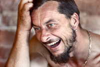
Some people have faces that were meant to be photographed :)
|
captured camera lens focal length aperture shutter speed shooting mode exposure bias metering mode ISO flash image quality RAW converter plugins (etc) cropped? |
5.43pm on 17/7/10 Canon 5D Mark II EF 70-200mm f/2.8L IS USM 200mm f/3.5 1/100 aperture priority +1/3 evaluative 100 no RAW ACR none no, but slightly stretched |
| Tweet |
|

|
|
| • 3x2 + people [portraiture] + no print + show the original | |||
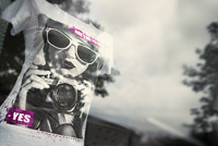
The Lumix GF-1 is a great camera for taking out when you don't want to lug the rest of your gear around, but one of the things I keep forgetting to think about is the 4x3 aspect ratio. The reason I mention this is that I often compose the shot using the LCD then subsequently decide that the image would look much better cropped to 3x2. Often, this isn't an issue - I just need to crop off the top or bottom of the image - but this wouldn't have worked for this shot as I would have needed to lose some of the T-shirt. So, instead, I stretched the right-hand edge of the image.
In other news: I published our latest Critique Slot Screencast a few days ago. If you're interested, take a look at the following link.
.../tutorials/online/critique_slot_screencasts.php
|
captured camera lens aperture shutter speed shooting mode exposure bias metering mode ISO flash image quality RAW converter plugins (etc) cropped? |
12.36pm on 31/7/10 Panasonic Lumix GF-1 20mm f/1.7 ASPH f/2.2 1/800 aperture priority +2/3 intelligent multiple 100 no RAW ACR Bokeh and Topaz Detail transformed to 3x2 |
| Tweet |
|

|
|
| • 3x2 + reflections [glass] + show the original + urban | |||

Here's another shot of Harmony and her new friend, taken about 20 minutes before my previous entry. As with that shot, you'll see that the original is quite dark. In this instance though, as I decided to fade out the background detail during post-production, I would have got away with a much brighter initial exposure.
|
captured camera lens focal length aperture shutter speed shooting mode exposure bias metering mode ISO flash image quality RAW converter plugins (etc) cropped? |
5.19pm on 17/7/10 Canon 5D Mark II EF 70-200mm f/2.8L IS USM 155mm f/4.0 1/80 aperture priority +1/3 evaluative 100 no RAW ACR Bokeh no |
| Tweet |
|

|
|
| • 3x2 + children [portraits] + no print + show the original | |||