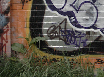
This is the bottom left hand quarter of the original RAW file and, as expected, it’s very dark and (though you can’t tell from this image) lacking in both contrast and saturation. The RAW file is the image as outputted from the camera’s sensor and always requires some adjustment, including Levels, Contrast, and Saturation.

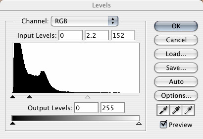
The Levels tool indicates that this image was underexposed – the graph is bunched to the left – probably as a consequence of the white lettering and the fact that it was a rather a dull day. Two adjustments were made. The rightmost adjustment triange (the one that isn't colour filled) was dragged down to a value of 152 resetting the white point of the image (what this does is tell Photoshop to treat values of 152 and above as though they were white which effectively expands the tonal range of the image).
The second adjustment was to set the middle triangle (grey filled) to a value of 2.2 – this sets the gamma, i.e. the overall brightness of an image, and a value of 2.2 is the standard setting I tend to use. Take a look at this tutorial which goes into more detail about using this tool.

This is the result of the Levels adjustment, and as you can see, the image is still quite dark, flat, and lacking in Saturation.

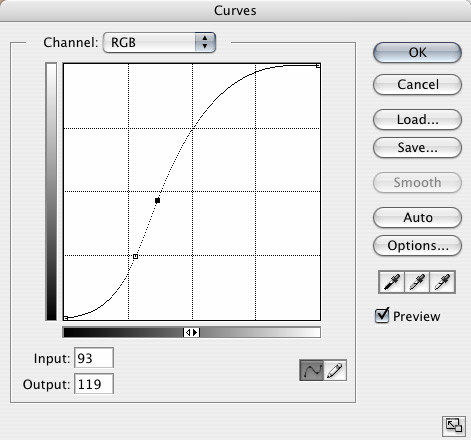
The Curves tool isn’t all that easy to explain, but it’s simple to use when you get the hang of it. Basically it allows you to remap the brightness levels of an image using a curve. Rather than attempt to explain it I’d recommend you look at this comprehensive tutorial which walks you through using this tool and will enable you to make sense of the curve that I used.
Basically, this curve slightly decreases the brightness of the darkest areas of this image and increases the brightness of the rest, particularly the mid to high tones.

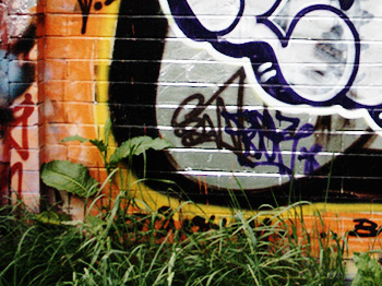
This is the result of the Curves adjustment, and as you can see, the image now has a decent amount of contrast and is much better saturated.

I was reasonably happy with the image at this point but thought that it might benefit from a further increase in saturation so I used Fred Miranda’s Digital Velvia Pro plugin (which mimics the saturation and colour balance of the film by the same name).
And the only other thing that was done was to sharpen the image using the Unsharp Mask.
I hope that was reasonably clear but if you do have any questions feel free to drop me an email at djn1 [at] chromasia [dot] com.
