two sisters / 12 May, 2004 [click for previous image: rash magic]
two sisters / 12 May, 2004 [click for next image: not yet titled]
© 2003–18 • all rights reserved
previous latest entry next

Title • two sisters

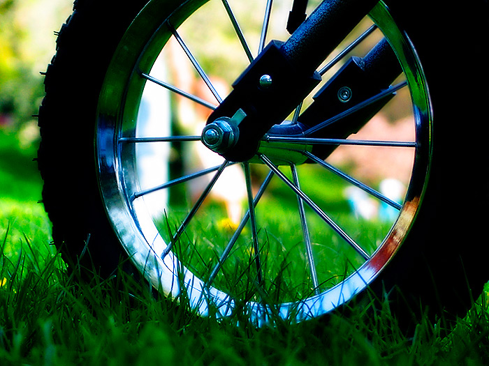
I don’t have too much to say about this shot, but I do have a request today.

I’ve been thinking about the way this blog is organised, and wondered how people use the various pages (particularly the archives) to view these images. I have my server logs, but they don’t really tell me who looks at what, they just give me the total figures for any particular page. So, when you visit Chromasia, which pages do you look at? I have my main archive page, which gives access to the monthly and category archives, and there’s the thumbnails page. Which of these do you regularly use?

Also, I’ve been wondering whether I should include thumbnails of recent images on my main page. This is a fairly standard thing to do (see groundglass for an example) but I’ve resisted it because I prefer to focus on the main image. So, would anyone prefer that I did and/or think it would add something to the site? A compromise would be to have dual index and individual entry archive pages, one without the clutter (as now) and one with (incorporating thumbnails, and maybe the comments and the image description - rather than have them appear as a pop-up). Anyway, let me know what you think. I don’t have time for a major redesign at the moment, but I am pondering some changes at some point.

camera
capture date
aperture
shutter speed
shooting mode
exposure bias
metering mode
ISO
focal length
image quality
white balance
 
Canon G5
2.19pm on 1/5/04
f3.0
1/400
aperture priority
+0.0
evaluative
50
28.8mm
RAW
auto
 
previous latest entry next