|
|


| previous | latest entry | next |
Title • climb every mountain
I had an email discussion a couple of weeks ago regarding the descriptions that I write to accompany my entries, and it was suggested that, perhaps, I "lead" the discussion by how I describe the worth of a given shot. So, for example, if I disparage something I put up – the focus isn't quite right, the composition could have been better – I get comments to match, and the same if I focus on something positive about the images I do like; i.e. I get a more positive response. So (as a quick experiment) either ...
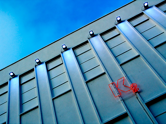
I really like two things about this shot: the simplicity and "clean" feel to the composition, and the contrast between the neon-red lettering and the muted grey/blue colour palette of the remainder of the image.
Or ...
While there are some things I like about this shot – the colour scheme (particularly the contrast between the neon-red lettering and the muted grey/blue colour palette of the remainder of the image), and the simplicity of the composition – I'm not convinced that it works. Somehow it's almost too "clean"/clinical and lacks any real focus other than the lettering.
Feel free to ignore both of the above ;-) More seriously, I really wasn't sure which category to put this image in so thought I'd wait and see what everyone else thinks – hence the new "uncategorised" category (which I know is a bit of a contradiction in terms ;-).
|
camera capture date aperture shutter speed shooting mode exposure bias metering mode ISO focal length image quality white balance cropped? | Canon G5 8.33pm on 27/7/04 f5.0 1/160 aperture priority +0.0 evaluative 50 9.1mm RAW auto no |
|
|
| previous | latest entry | next |
about us |
training |
blog |
|||


