tourist typography / 18 February, 2006 [click for previous image: curtains al'orange]
tourist typography / 18 February, 2006 [click for next image: old post (diptych)]
© 2003–18 • all rights reserved
previous latest entry next

Title • tourist typography

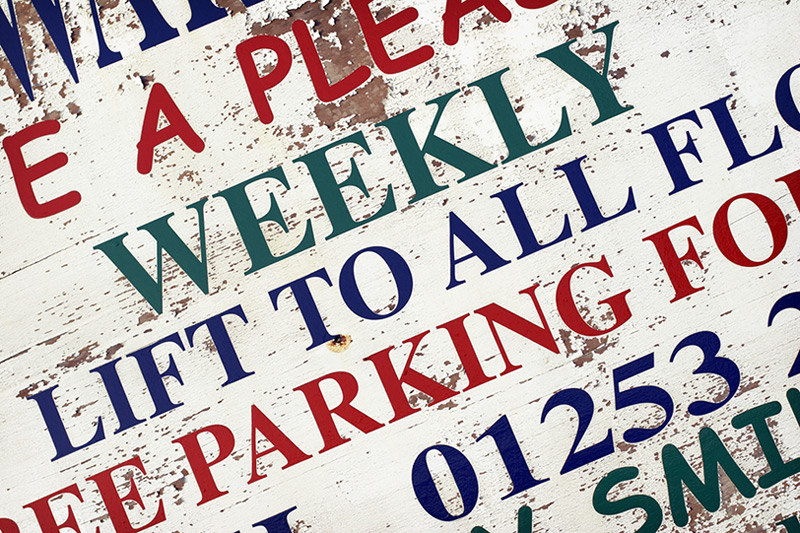
In Blackpool there are several thousand guest houses and hotels, most of which appear to be operating on fairly small budgets, and everywhere you go there are signs such as this: "free parking", "tea and coffee in every room", "some rooms en-suite", and so on. Most of the time I don't notice them anymore – their pervasiveness renders them almost invisible – but as soon as I saw this one I wanted to photograph it, mostly because it captures the feel of many of these signs: brash, primary colours, peeling paint, generic text, and so on ...

Anyway, I suspect that this isn't an ideal blog shot, and would be more suited to an extended project on this theme, but I thought I'd put it up anyway. Which I guess is an interesting topic of conversation in its own right: are there necessarily certain photographs, or types of photographs, that simply aren't suited to this medium? That said, if you don't like this one, I suspect you probably won't be reading this anyway – which I guess is an answer in its own right ;-)

captured
camera
lens
aperture
shutter speed
shooting mode
exposure bias
metering mode
ISO
flash
image quality
RAW converter
cropped?
4.09pm on 17/2/06
Canon 20D
EF 50mm f/1.4 USM
f/4.0
1/1250
aperture priority
+0.0
evaluative
100
no
RAW
C1 Pro
no
previous latest entry next