the absence of dreams / 28 May, 2006 [click for previous image: shell on the beach]
the absence of dreams / 28 May, 2006 [click for next image: urban canvas]
© 2003–18 • all rights reserved
previous latest entry next

Title • the absence of dreams

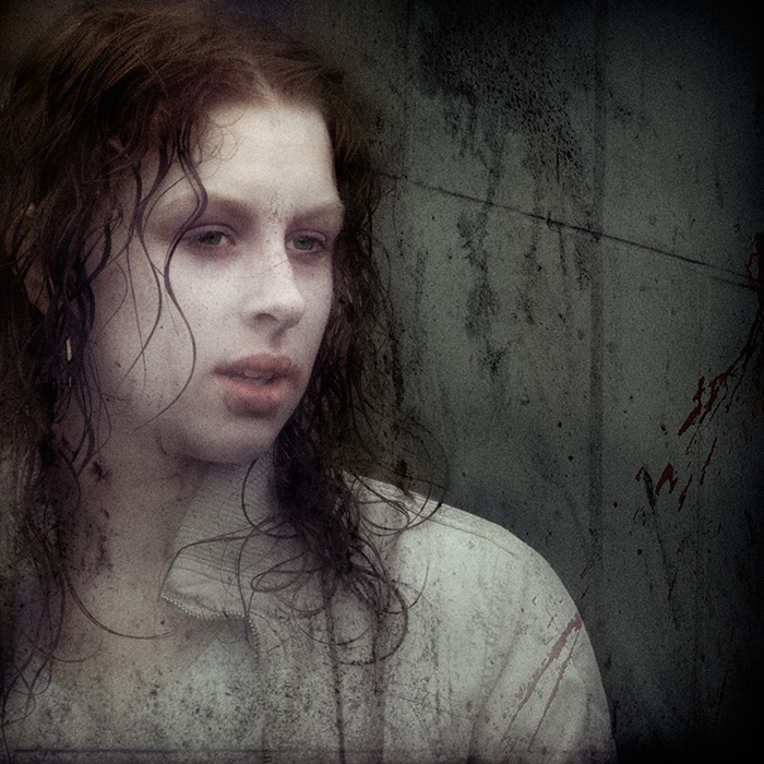
I mentioned in a comment the other day that when I edit a shot I don't add in anything that isn't there; i.e. I wouldn't add a dramatic sky from one shot to a striking foreground from another. However, there are occasions when I've blended two (or more) shots, and this is an example of the same technique. The original included a few people to the right of the girl, and despite numerous attempts to process this shot they remained a distraction. So, rather than black out the background altogether I borrowed a section of the wall from this shot.

The inspiration for this style of image comes from Mike Regnier, a fine art photographer that I've long admired. If you're even vaguely interested in this shot, then you should take a good look around Mike's site (there are various sections, including a blog) as he's produced some wonderful images that truly put this one to shame.

So, to forestall the inevitable, this isn't a straight photograph, but, in my opinion at least, it works a lot better this way; mostly, I suppose, because of the story in my head as I took the shot - my reaction to her expression, and the sense I had that she seemed rather lost. This is a style that I'm going to explore in the future, so I'd be definitely interested to hear your thoughts.

Oh, and if you're interested, the original is here:

.../archives/the_absence_of_dreams.php

captured
camera
lens
focal length
aperture
shutter speed
shooting mode
exposure bias
metering mode
ISO
flash
image quality
RAW converter
cropped?
8.59pm on 20/5/06
Canon 20D
EF 70-200 f/4L USM
168mm (269mm equiv.)
f/5.6
1/400
aperture priority
-1/3
evaluative
100
no
RAW
C1 Pro
1x1
previous latest entry next